March 11, 2024
A shopper just finished perusing your website. They’ve filled their shopping cart with goodies only you can provide and now stand at the threshold of commitment at the end of the checkout process: the checkout page. This moment is where either the magic happens or fizzles into the abyss of abandoned carts.
Why does the checkout page wield so much power? Well, it’s the ultimate test of your online store’s charm, efficiency, and trustworthiness. Get it right, and your bottom line will thank you. Get it wrong and you hit a sour note in an otherwise perfect performance.
Chapters:
- What is the checkout process in e-commerce?
- How to improve your e-commerce checkout process
- A step-by-step guide to implementing checkout process optimization
- Don’t stop at the checkout process
What is the checkout process in e-commerce?
The checkout process in e-commerce is the journey a shopper follows when buying items from an online store. The flow begins when the shopper adds one or more items to their shopping cart and ends when they receive confirmation their purchase has been completed.
The checkout is the point where the customer adds their payment details and purchases the product(s). Your whole checkout process needs to be as clear and frictionless is possible to provide the best shopping experience possible that encourages shoppers to complete their purchases.
How to improve your e-commerce checkout process
You have questions, we have the answers. These are our top tips to give your customers a checkout experience they’ll love so much, they’ll soon be back for more.
1. Optimize for mobile
In the US alone, 76% of consumers shop using mobile devices. The percentage is even higher (91%) for the 18 to 49 demographic. Ignoring this fact (and failing to optimize your checkout process accordingly) is like showing up to a marathon in flip-flops — you’re just not prepared for the race. And you’ll probably get a scraped knee. Or two.
First off, size matters. Make all clickable elements thumb-friendly, because nothing tests patience like trying to hit a tiny button on a touch screen.
Speed is also of the essence. A slow-loading checkout is a no-go, so optimize images and leverage mobile-specific features like digital wallets to keep things moving at a brisk pace.
Another neat trick is including the option to scan a credit card using the phone’s camera. This feature not only adds a layer of modern convenience but also significantly speeds up the payment process.
2. Implement trust signals and social proof
In e-commerce, trust is the currency, and your checkout process is where shoppers invest it. If you want to reassure them that it’s safe to take that final step, you need to signal trust — whether it’s through user-generated content (UGC), badges, or both.
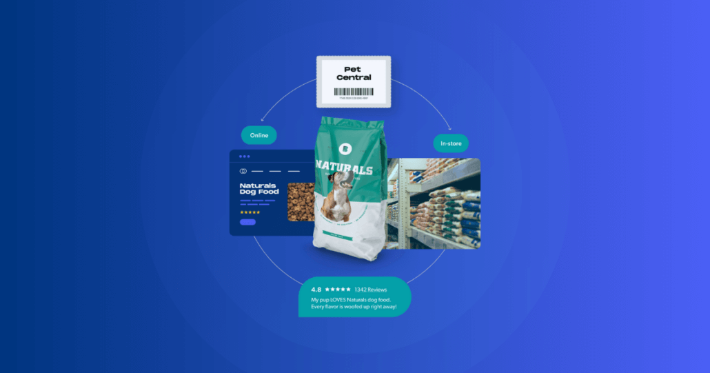
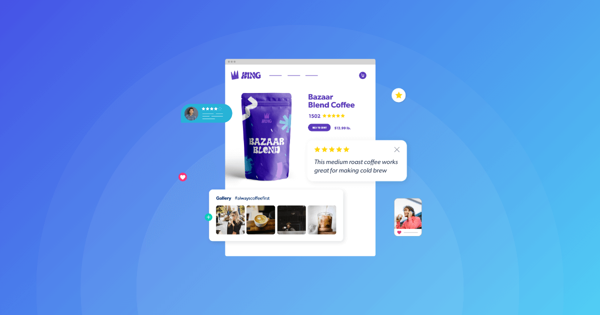
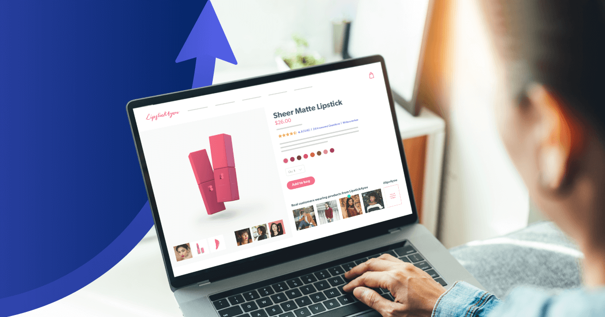
Displaying UGC is literally having your customers vouch for you at the checkout line. According to our Shopper Experience Index, 78% of shoppers rely on this content to feel more confident in their purchases. Whether it’s a photo of a happy customer or a glowing review, incorporating these elements around your checkout can significantly boost buyer confidence.
Badges instantly signal to your customers that your site is secure and their information is protected. Examples of these trust signals include SSL certificates, which encrypt data, and payment badges like Visa, Mastercard, and PayPal.
Familiar logos offer a sense of security and familiarity amidst the vastness (and general insanity) of the internet.
Pro tip: Bazaarvoice helps you collect, syndicate, and display user reviews and other UGC across your online store and your retail partners’ websites.
3. Don’t make account creation a deal-breaker
Not everyone is ready to commit to a full-on relationship with your site on the first date (sorry to be the bearers of bad news, but they probably have other dates lined up). Creating an account might be a minor inconvenience for some people, but for others, it can be a deal-breaker.
Aim for convenience by offering paths that cater to all types of visitors. Options like signing in with social media or continuing as a guest can transform the checkout experience from a high-pressure sales pitch to a casual “come as you are” moment.
Social media sign-ins leverage existing profiles, so the process feels less like a commitment and more like seeing a familiar face in a crowd of strangers. On the other hand, allowing customers to continue as guests is the e-commerce version of “no strings attached, let’s just enjoy the moment.” It’s an invitation to explore without the need for pesky formal introductions.
Pro tip: You can use third-party services like Auth0 to provide social sign-in options. If you’re using WordPress, Shopify, or any of the popular CMS, CCMS, or e-commerce systems, you can browse their app stores or directories for integrations.
4. Clearly communicate fees and shipping
Finding the perfect product is exhilarating, but you know what’s not so great? Getting hit with unexpected fees and shipping costs at checkout. Turns out, this is the number one reason for abandoned shopping carts. Surprise!, said no one.
Lay all of your cards on the table from the get-go. Whether it’s a detailed breakdown of costs or a shipping calculator that adjusts in real-time, giving your customers a clear view of what they’re paying for (and why) builds trust and sets expectations right away.
But why stop at just being transparent? Go the extra mile by offering shipping options that cater to different needs and budgets. From standard to express shipping, providing choices allows customers to weigh their options based on how quickly they need their items and how much they’re willing to pay for speed.
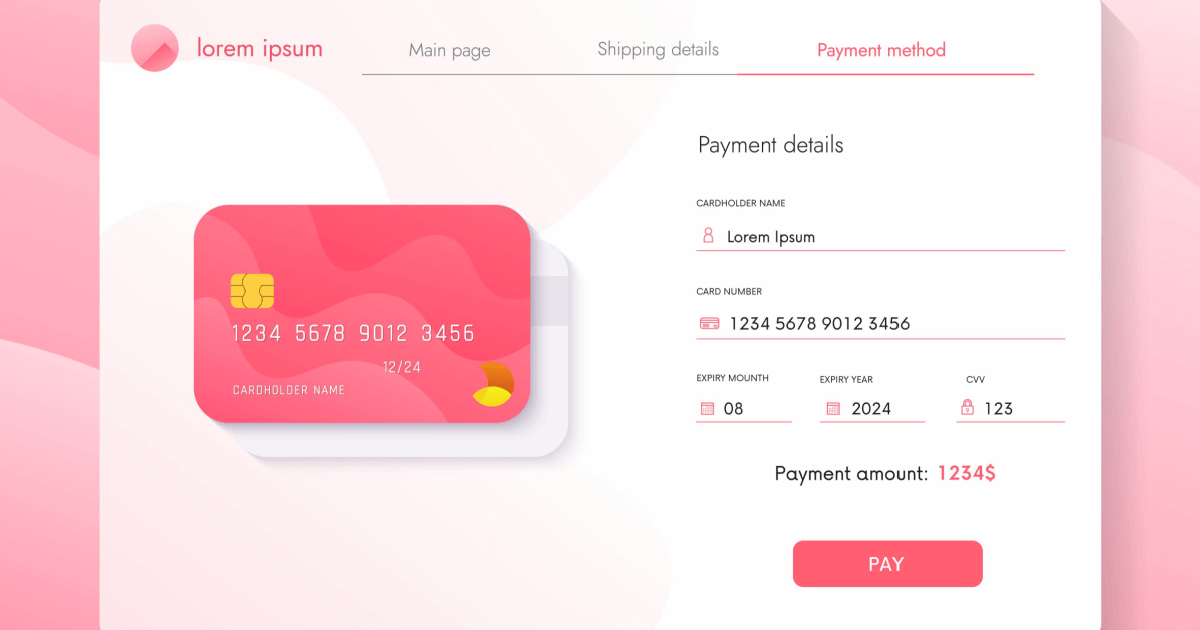
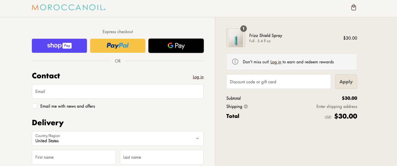
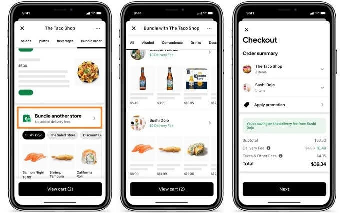
5. Offer multiple payment options
How often have you been slightly annoyed by those places that only take cash? It’s a pain to make your way to the closest ATM. That’s how customers feel when their preferred payment method isn’t available. In this case, there’s no magic money box to go to. They’ll likely just leave.
No matter where your customers come from or how they prefer to spend their digital dollars, accommodate them. Each payment method comes with its own security assurances, appealing to the varying levels of trust and familiarity within your customer base.
From credit cards and PayPal to Apple Pay, Google Wallet, cryptocurrency, and buy now, pay later solutions, the more options you provide, the wider the door you open to potential sales.
6. Display a progress indicator
A progress bar is a simple addition, but one that turns the checkout process into a clearly marked journey, complete with milestones and an end in sight. More than reducing anxiety and/or impatience, it taps into the sweet feeling of completing tasks. Each step forward is a small victory that encourages people to keep going until they reach the finish line.
Implementing a progress bar is also an opportunity to refine and streamline your checkout process. By breaking down the journey into distinct steps, you can identify and eliminate any unnecessary complications.
Each segment of the progress bar should represent a clear, concise, and necessary action. This speeds up the transaction and minimizes the chances of customers getting lost or overwhelmed along the way.
Pro tip: Providers like FastSrping and FunnelKit make it easy to build a progress bar, and the Shopify app store offers integrations with apps like CheckIt for the same purpose.
7. Allow one-click purchases
We love fast-forwarding through ads, so why not fast-forward through shopping? For customers who’ve already bought from you and built a steady, trusting relationship, one-click purchases are a boon. No need to re-enter information — they can just slide on by and see ya next time.
When customers know that making a repeat purchase is as easy as a single click, they’re more likely to come back. It’s a simple equation: less hassle = more sales. This feature also positions your brand as tech-savvy and customer-centric, attributes that can strengthen customer loyalty and set you apart in a crowded marketplace.
Pro tip: You can find third-party providers like Stripe to help you set up one-click purchases seamlessly.
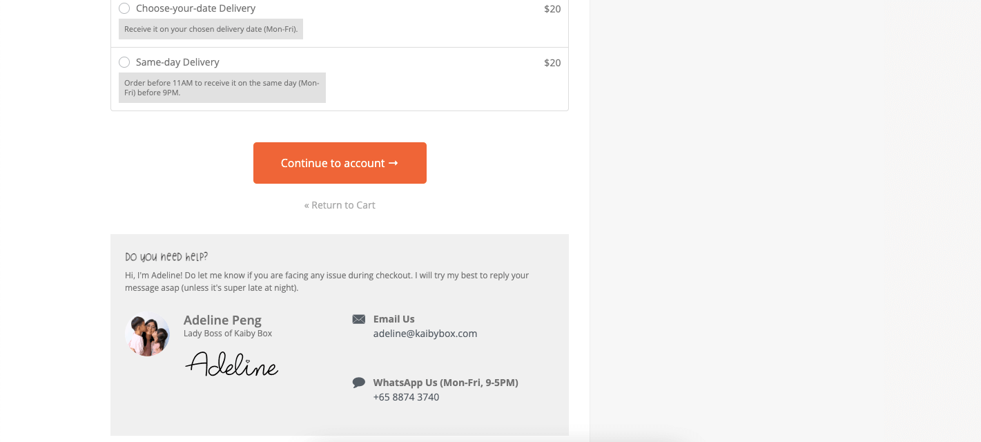
8. Make support options available
Stuff happens. Maybe it’s a promo code that won’t apply or a shipping question that’s got shoppers stumped. Either way, making sure they have someone or somewhere to turn to with their issues can be the difference between a sale and an abandoned cart.
Support can come in many forms, from live chat to an on-page FAQ or a Customer Success Manager’s contact details. What matters is that you show that you’re there to help, not just sell. It’s an extra level of care and attention that can turn a one-time buyer into your #1 fan.
9. Reduce the number of mandatory form fields
Less truly is more. Do you honestly know anyone who’s ever said “oh goody, can’t wait to fill out this 25-page form”? No? That’s because they don’t exist (yes, we checked. Trust us). Keep this in mind when you’re designing your checkout flow.
Focus on the essential information — the customer’s name, billing address, shipping address, and contact information. That’s enough, you don’t need their whole life story. More than that, and you risk them giving up on the whole process.
Remember that optimizing e-commerce checkout is about removing obstacles and making the buying process as inviting as a freshly baked pie on a windowsill.
10. Simplify discount application
Making customers jump through hoops to apply coupon codes will quickly sour an otherwise sweet deal. You likely gave them away to begin with, so make the option to apply them clear and accessible, without cluttering the checkout process experience.
When customers easily see how much they’re saving, it reinforces the value of their purchase, making them more likely to hit that final “buy” button. Plus, a straightforward process can enhance the overall shopping experience. It shows that you’ve thought about every detail of the customer journey — even the part where they save some bucks.
11. Offer last-minute deals
Speaking of discounts, why not offer them during the checkout process? It’s a sneaky way to increase average order value while giving customers something in return (like sales items or free shipping).
You’re basically capitalizing on the momentum of the buying decision. At this point, shoppers are already committed to making a purchase and a last-minute offer can be the nudge that makes them feel like they’re getting even more bang for their buck.
Not to mention, last-minute deals are an excellent opportunity to clear out inventory or promote specific products. By strategically choosing which deals to offer, you can boost sales while managing your stock more effectively. Win-win.
12. Confirm the purchase
Congratulations, you’ve got yourself a purchase! Quick tip here: don’t leave customers hanging. The moment after a purchase is your chance to leave a lasting impression. With a thoughtfully designed thank you page, you can transform a transactional moment into the beginning of an ongoing, beautiful, profitable relationship.
Brief your customers on what comes next with clear instructions about shipping timelines, customer service contact information, and how to track their orders. Your thank you page can also be a platform for deepening customer engagement.
Here, you can provide suggestions for related products, invitations to join your loyalty program, or even a simple request for feedback.
A step-by-step guide to implementing checkout process optimization
You have the latest and greatest tips. Now, it’s time to actually optimize the checkout flow. And as with most things in life and business, it’s somewhat of a process — but not a complex one.
Step 1: Evaluate your current checkout process
Start by walking a mile in your customers’ shoes and run through the checkout process yourself. Take note of any friction points, such as unnecessary form fields, confusing navigation, or lack of payment options. These are your first clues on what needs optimizing. Or have someone in a different department try it out for you.
Next, dive into the data. Analytics can reveal where potential customers drop off and which steps might be causing hesitation. Look for patterns and trends that point to specific areas for improvement.
Don’t forget to gather feedback directly from the source — your customers. Surveys, feedback forms, or direct conversations can provide invaluable insights into their experiences and perceptions.
Step 2: Set clear objectives
Turn your insights into actionable goals. First, prioritize the issues you’ve identified based on their impact on the customer experience and your conversion rates. Is it the insane number of form fields that are slowing customers down? Or perhaps the lack of a guest checkout option causing them to abandon ship?
Each issue should correspond to a specific objective, such as “reduce checkout time by 30%” or “decrease cart abandonment rate by 15%.”
Your objectives should align with both customer needs and your broader business goals. Whether it’s increasing average order value or boosting repeat purchases, each goal should contribute to the overarching vision of your e-commerce success.
Step 3: Implement the changes
This is where strategy meets action. Begin by tackling the low-hanging fruit — those changes that are relatively easy to implement but can have an immediate impact on the customer experience. It might include simplifying form fields, ensuring your site is mobile-responsive, or adding visible trust signals and security badges.
Next, address more complex issues that may require a bit more time and resources (e.g. integrating new payment options, developing a one-click purchase feature, or redesigning the entire e-commerce checkout page for better usability).
While these changes might take longer to roll out, their potential to significantly boost conversions and customer satisfaction over time makes them well worth the effort.
Step 4: Monitor and refine
The checkout optimization journey doesn’t end, it simply evolves. You want to fix what’s broken, but more than that, you want to continuously improve the checkout process.
Monitor the impact of the changes you’ve implemented. Use analytics tools to track key metrics such as cart abandonment rates, conversion rates, and average order value. Keep gathering customer feedback through surveys, user testing, and direct communication for qualitative insights that complement your quantitative data.
Some changes may yield immediate positive results, while others might need further tweaking to achieve their full potential. Keep adjusting until you hit the sweet spot. Flexibility and willingness to learn from successes and setbacks are key to long-term improvement.
Don’t stop at the checkout process
Your checkout page is super important, but so is the rest of your e-commerce site. After all, a smooth checkout process on a website that’s otherwise difficult to navigate or slow to load doesn’t quite make sense. You want to provide a user-friendly experience from the moment customers land in your store to the moment they complete their purchase.
For more insights and practical tips on how to enhance your performance across the board, check out these 15 ways to improve your e-commerce website performance.