May 9, 2022
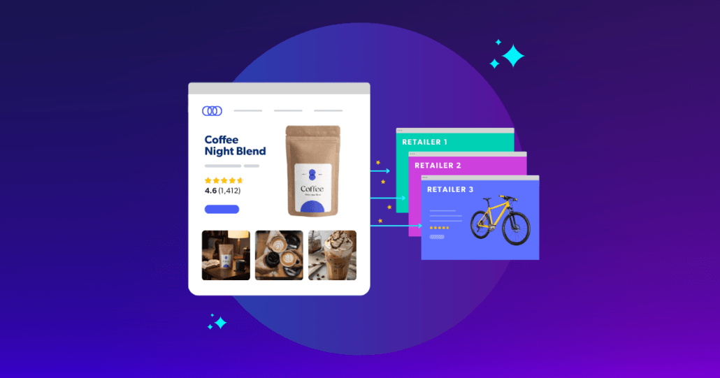
Product detail pages (PDPs) are the backbone of every online store. But in today’s competitive e-commerce landscape, getting these pages “right” is a constant challenge, which is why we’ve complied this list of our favourite e-commerce product pages.
The Baymard Institute reviewed thousands of product pages from companies in the U.S. and E.U. and found that only 18% of the 141 top-grossing e-commerce sites have a “good” or “acceptable” product page design and user experience (UX). And UX is only part of the equation.
To meet the needs of time-poor consumers and build best-in-class PDPs, brands will have to continually optimize the consumer experiences or risk higher bounce rates and lower conversions.
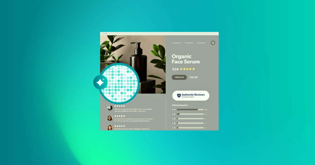
What’s one full-proof way to optimize the consumer experience? User-generated content (UGC). In fact, Bazaarvoice ROI benchmark data shows that when consumers engage with any UGC, like written reviews or customer imagery, there’s a 144% increase in conversion.
If you’re looking for some product page inspiration, check out 12 of the best e-commerce product pages that feature UGC.
E-commerce product pages: best of the best
- Burt’s Bees: Put social proof front and center
- Under Armour: Show off every inch of the product
- Neutrogena: Personalize the page for each shopper
- Best Buy: Leave no product spec unturned
- Kid Kraft: Include imagery of the product in use
- Bose: Let shoppers “test” the product
- Casper: Incorporate GIFs to show how the product works
- Mecca: Recommend additional products to increase AOV
- Nordstrom: Bring the in-store experience online
- Sephora: Highlight awards and accolades
- Primal Kitchen: Give ideas for how to use the product
- Yeti: Allow shoppers to search reviews to find information they need
1. Burt’s Bees: Put social proof front and center

This is the best of the best e-commerce product pages we’ve seen. When potential customers land on the product page for Burt’s Bees Sensitive Solutions Gentle Cream Cleanser, one of the first things they see is the average star rating and number of reviews for the product. This instantly proves to the shopper that this is a high-quality, well-loved cleanser.

Then, the brand uses large product imagery to show shoppers precisely what they’re getting. One of the images for the product even puts social proof front and center by highlighting a star rating and quote from a review written by a real customer.

Burt’s Bees also incorporates how-to instructions for the product in the imagery and product description so shoppers understand what the product is for, when to use it, and what similar products will help complete their skincare routine.
2. Under Armour: Show off every inch of the product
On this product page for one of Under Armour’s many pairs of running shoes, the company goes beyond high-quality images of the product.

This product page offers shoppers the opportunity to get a complete, 360-degree view of the shoe. Multiple images and views lets the customer know there won’t be any surprises when they receive the product.

Once the shopper gets to the customer review portion of the page, they can filter by rating, athlete type (casual or avid), size, and locale to see more personalized reviews of how they may be using the shoe.

Finally, when scrolling down the page, the “Add to bag” button becomes a sticky banner so people can quickly put the item in their cart once they decide it’s the right product for them. This simple UX design is a powerful way to reduce friction in the buying process.
3. Neutrogena: Personalize the page for each shopper
Makeup is difficult to buy online when a shopper can’t see or swatch the shades. That’s why Neutrogena’s product pages have an extremely personalized “Try It On” feature that allows shoppers to upload a photo of themselves to see what various lip colors will look like (or they can choose a model that most resembles them).

Then, about halfway down the page, there’s a prominent design element that includes a star rating and a quote from a customer about how the product feels in real life and how it works for their skin texture.

On the review section of this page, there’s a “Most Helpful Reviews” callout section that highlights one positive and one negative review that other shoppers have found useful. This element makes it easy for consumers to make a fast and confident purchase decision without having to wade through many different reviews.

4. Best Buy: Leave no product spec unturned
When it comes to selling electronics online, product specs and details matter. For this Samsung TV, Best Buy highlights product specs and questions and answers in easy-to-navigate modules on the product page. Best Buy even uses icons and bulleted lists to explain the product details rather than forcing people to read a lot of technical copy they may not understand.

The product page also has a lot of video content about the product to help consumers better understand the quality and functionality of this TV before they pull the trigger.

At the top of the reviews section, Best Buy provides a robust summary and highlights from reviews to show shoppers the sentiment toward the product without requiring them to read every single review. Plus, review images at the top of the review section let browsers quickly click through user-generated photos to see how the product looks and works in real peoples’ homes.

5. Kid Kraft: Include imagery of the product in use
The best e-commerce product pages all have one thing in common: great imagery. Having fantastic brand imagery sets you apart, but if you can include great imagery that showcases people using the product, that’s even better. The images for Kid Kraft’s Cozy Escape Playhouse show several ways families have used and decorated the house to help new shoppers visualize these homes in their own yards. Even in the “Features” section of the page, each feature has an image showing that specific part of the playhouse.

The brand also uses icons at the top of the page to call out important info for shoppers, like if the product is in stock, what age range it’s meant for, and whether it’s a top-rated product.

6. Bose: Let shoppers “test” the product
Bose tries to make it easy for customers to get all the information they need about its noise-canceling headphones in its e-commerce store. Above the fold, the brand uses icons and short, impactful copy to highlight the specific features and differentiators of this pair of headphones.

The review section of the page is very focused on the headphone’s features as well.
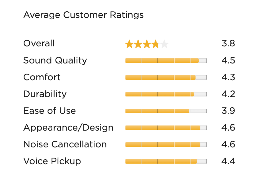
Shoppers can easily see how the product ranks in feature categories like sound quality, comfort, noise cancellation, and more.
The showstopper on this page is an interactive module that lets shoppers actually hear how much noise the headphones can cancel out in a busy, noisy room. This gives customers the ability to “test out” the headphones without ever going to a store.

7. Casper: Incorporate GIFs to show how the product works
Mattresses are another category where a great product page makes all the difference. On this product page, Casper provides as much information as possible about its original mattress and even anticipates customer questions.
For example, at the top of the page, the shopper must choose between an all-foam or hybrid mattress. Casper knows that the everyday person may not know the difference between the types, so it has a pop-up that gives more information about the benefits of a hybrid mattress.

Casper also includes a GIF-style product image that shows how the mattress conforms to the user’s body if they were to toss and turn in their sleep. This is essential because, as we mentioned above, the shopper can’t physically test the mattress from the e-commerce store, so making them feel like they are trying the product is the next best thing.
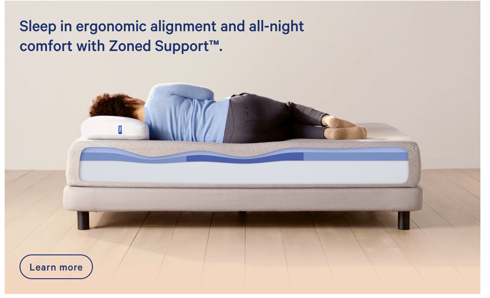
Finally, on the site’s review section, Casper helps customers find what they’re looking for by asking them to filter reviews based on their needs, like body pain or comfort.

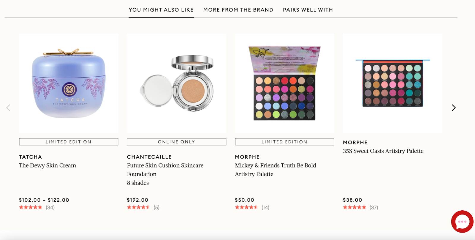
8. Mecca: Recommend additional products to increase AOV
Beauty store, Mecca, makes it easy for customers on their eyeshadow palette’s product page to know if they want to make a purchase. First, the large product imagery allows the shopper to see every single shade in this palette.

Then, to increase average order value, Mecca recommends other products the shopper may like based on their interest in this palette. This section of the page is clean, easy to navigate, and doesn’t take up much room on the page.
The reviews section of this page allows shoppers to know if these colors will work with their faces by detailing previous reviewers’ eye color and skin tone. Mecca also asks past customers if they have received the product in exchange for a review.
Shoppers today consider incentivized reviews and non-incentivized reviews equally credible. In fact, 58% of U.S. shoppers say that incentivized reviews can inform their purchase decision just as much as organic reviews can.

9. Nordstrom: Bring the in-store experience online
On many of Nordstrom’s e-commerce product pages, like this one for a pair of jeans, the company includes a video of a sales associate detailing more info about the clothing item and how it fits. This mimics an in-store experience where an employee may be able to help a shopper pick the right items.

Nordstrom also gives customers style ideas to complete the outfit with other Nordstrom items. Some of these looks are designed by Nordstrom, while others are put together by Nordstrom customers.
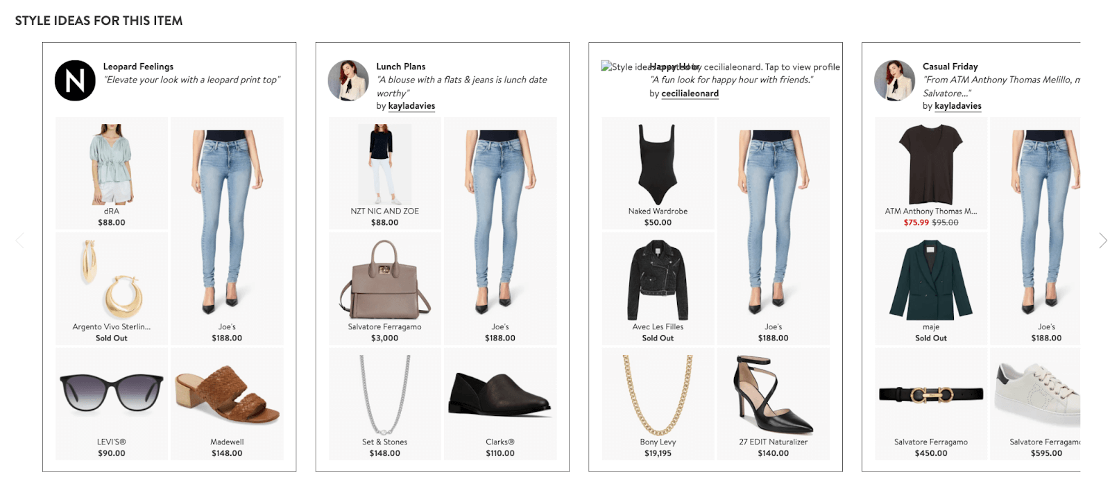
The review section highlights the most common pros and cons mentioned in reviews, so shoppers quickly understand their peers’ opinions without having to read every single review and can make their purchasing decision faster.

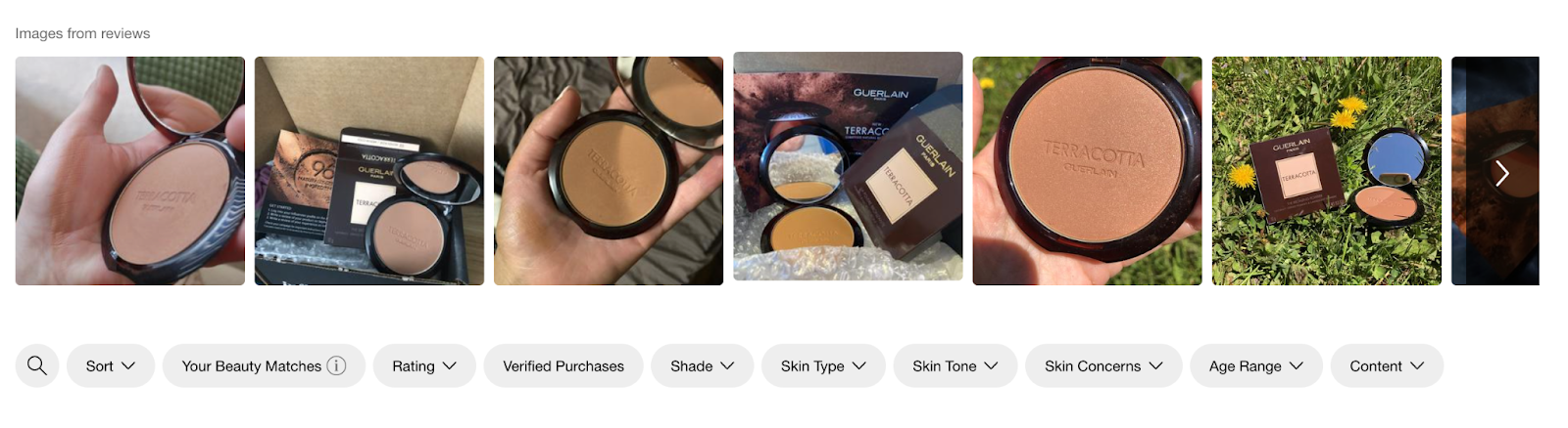
10. Sephora: Highlight awards and accolades
Sephora sells thousands of make-up products, so to help shoppers choose, the brand denotes awards and accolades for products on product pages. For this bronzer, Sephora makes it clear that this product won an Allure Best of Beauty award in 2021.

Like several other brands we’ve featured, Sephora also uses cute icons paired with short, informative copy to give customers the rundown on the product’s best features.
To help people understand what a product would look like on them, Sephora lets people filter reviews in several categories, like skin tone, skin concerns, age range, shade purchased, and more. Shoppers can also see what the product looks like on real people by scrolling through the visual UGC gallery at the top of the reviews section on the page.
11. Primal Kitchen: Give ideas for how to use the product
Primal Kitchen uses its product pages to reduce the risk of ordering pantry staples online. On the product page for the brand’s Chipotle Lime Mayo, Primal Kitchen has a short product description that details how the product tastes compared to regular mayo and gives suggestions for foods to use it on.

The brand takes these suggestions even further halfway down the page by offering up a few recipes that include this item to help the shopper work this purchase into their weekly meal plan rather than let it sit unused in the pantry.
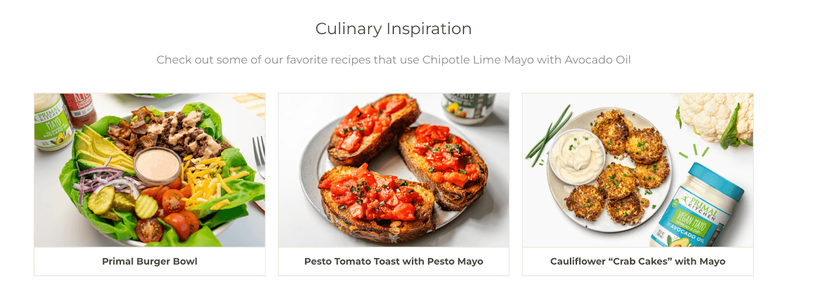
The risk of ordering this food is reduced even more when the shopper gets to the reviews. At the very top of the review section, Primal Kitchen leverages social proof by highlighting the percentage of customers who recommend the product (in this case, 99%).

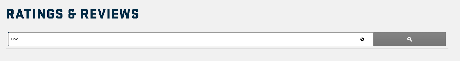
12. Yeti: Allow shoppers to search reviews for what they’re looking for
Our final example of best e-commerce product pages is from drinkware brand, Yeti. For this tumbler, Yeti offers cross selling options above the fold that help the shopper complete their purchase.

Also, rather than having a questions and answers module at the bottom of the page, Yeti took the most common customer questions and incorporated them into the product page copy itself, so customers don’t have to go hunting for the answers they’re looking for.

Finally, the reviews section of the page offers a search option. Customers can search reviews for certain words to see if past customers have mentioned any concerns or use cases. For example, if you search the word “cold,” Yeti finds all the reviews with that word so shoppers can specifically learn how good this tumbler is at keeping drinks cold.
Optimize your best e-commerce product pages
By taking inspiration from some of the best e-commerce product pages around and implementing these strategies on your own site, your brand will see an increase in conversion rate. Don’t be afraid to mix and match some of these techniques when testing out your new product pages to see what resonates most with your audience.
Want more ways to improve the consumer experience and boost conversions on product pages? Learn more about how to optimize product pages.